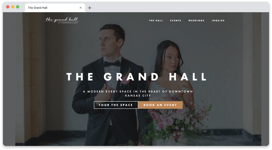
The Grand Hall
UI/UX Marketing Website
Context
The Grand Hall is a local wedding venue located in downtown Kansas City. It is one of the most elegant and pricey venues in the entire city. The venue was owned by the parent company that my team worked for. Our team was commissioned to design and build a brand new site to replace their old one. As one of the most iconic buildings in the Kansas City skyline - a website that accurately represents the building's past, present, and future was necessary.
The Problem
The Grand Hall had an existing website at the time. One could say it was not in very great condition. Broken links, slow load times, and outdated information plagued the site. The stakeholders approached us wanting a site that represented the elegance of The Grand Hall.
My Role
Support UI/UX
Research
Website build
Discovery Questions
The discovery question phase of this project helped my team to gain insight into what the stakeholders wanted out of this site. We were able to glean a better understanding of how the stakeholders wanted the site to function and the overall look and feel to be. Being able to understand where their needs are at and what elements of the new site are important to them is critical to a successful build for us.
Here are a few of the questions that our team asked them with their responses to them in this phase:
Why do you want a new website?
- Not the best representation of the space and the feel of events that take place. User flow isn’t getting people to where they need to be. More informative and engaging.
What’s the primary purpose of the new website?
- Information capture. Allow the GH staff to follow up with the highest quality information possible. Understanding who to prioritize and who to target as far as leads.
Who is your primary audience?
- Those seeking high-end, premium, events. Those that can afford big-budget events. Females in their early to mid 20’s, mothers early 40’s to 60’s. Very few male inquiries.
What goals will indicate success in making an investment in a new website?
- More qualified leads. A higher conversion rate of quality customers.
What do you like and dislike about your current site?
- Navigation items aren’t clear. Copy is very fluffy, and not concise. The balance between too much content and not enough information.
What functions are absolutely necessary for your new site?
- Inquiry form.
- Weddings are the bread and butter, must be present, even though they aren’t the only thing they do.
- High-level info on what is included with the event.
What do you want newcomers to know or do on your site?
- Don’t nickel and dime on chair upgrades. Table sizes and so on are included.
- Where is the venue located? People are confused about where it lives, physically.
- You can alter the building’s color, you can literally change the kc skyline.
- All glassware included, full-service bar included. No upcharges.
- Full-service experience: Cocktail hour, ceremonies, 30-minute photoshoot on the rooftop.
- Not wedding planners, but take pains to curate the best caterers, planners, etc. Quality of service, everyone they work with is licensed and insured.
- Other: Parking, where to stay, shuttle info.
- Possibly add an Instagram feed.
What we learned is the stakeholders wanted to promote the venue for more than just weddings. The Grand Hall can host corporate and non-profit events. There needed to be a strong emphasis on the new website that The Grand Hall is much more than just a wedding venue site.
Research
When starting the research phase our team had to narrow down what was important information to assist us in the scope of this build. It could become very easy to get lost in the weeds of how extensive the wedding industry is if we did not have a clear picture of what we needed to accomplish.
There are over 11,000 weddings that happen in the Kansas City metro area every year. Our target audience all of a sudden became very large and diverse. We oriented ourselves to consider the social status of The Grand Hall and the couples that could afford to have a wedding there. Not every couple in the city could be in our target audience.
With a 25k minimum budget starting point, many couples would be out for the price alone. That meant that our target audience has been narrowed down to a reasonable population. Due to the nature of wedding venue searching for couples being stressful and competitive- we found that the average time on a page for wedding venues is around 25 seconds. They were gone and looking for a new venue if they didn’t see a good fit very early on. That means we would not have much time to impress a potential customer before they would be on to the next venue site.
This user persona helped us focus on who our target audience would be.
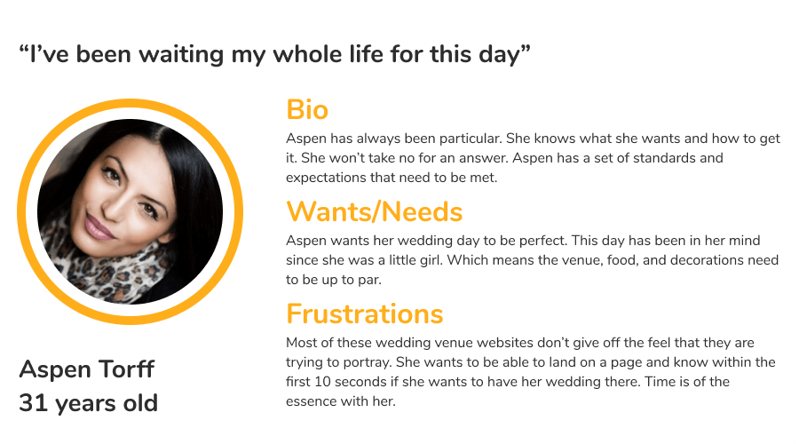
We knew this website had to show off the elegance of The Grand Hall, and be easy to reach out and inquire due to the short nature of time on the page. All of these findings led us into the next phase of the design process.
Site Map
The creation of a site map allowed our team to put together a cohesive flow that allows for users to easily navigate, and have plenty of insight into what type of wedding/ event they might have.
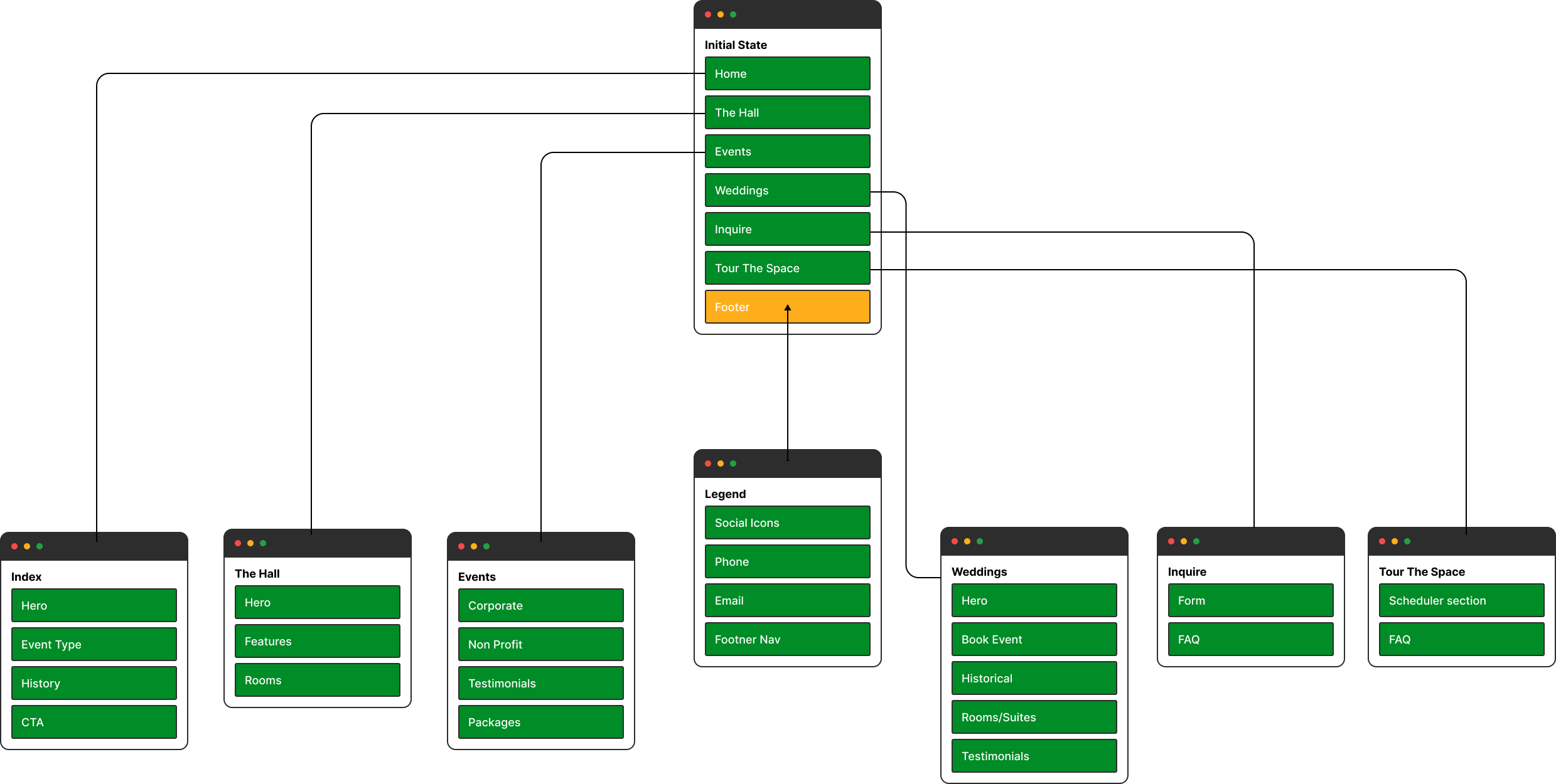
Content Outline
Home Page
Hero Section
A visual entry to the core message of the Grand Hall meant to captivate and engage.
- Photo background that gives a pleasing first impression of the venue.
- A small amount of supporting copy (1-2 sentences).
- CTA button that links to the Inquire Page.
Events-Types Section
Events-Type Showcase teasing the different broad event options that can be held at the Grand Hall.
- Section A: Weddings teaser with a CTA button that links to the Weddings Page.
- Section B: Corporate Events teaser with a CTA button that links to the Corporate Events portion of the Events Page.
- Section C: Non-Profit Events teaser with a CTA button that links to the Corporate Events portion of the Events Page.
- Small CTA linking to the Inquire Page.
Photo/History Section:
Marrying the photographic imagery of the website with the historical context of the venue allows the two aspects to reinforce each other while minimizing the length of the page and the amount of text. This section also demonstrates the prestige and aesthetic beauty of the Grand Hall while educating the user in a succinct manner.
- Photo Gallery with short and splashy content (1-2 sentences).
- Tidbits of the history tied into copy, possibly by displaying text over images when hovered on.
- Small CTA to learn more about the Hall (links to The Hall Page)
CTA Section
Entices the user to reach out through the Inquire Page.
- CTA with a button that links to the Inquire Page.
Footer
Links and navigation elements.
Events Page
Weddings and other event-types are split into two pages to allow us to dive deeper into the staple event of weddings, while showcasing and highlighting the merit of other event-types without diluting the message of either.
Hero Section:
- A message designed to highlight the various types of events that can be hosted at the Grand Hall and to inspire and excite the user about the prospect of their own event.
- A photo or video background showcasing the space and amenities.
- CTA button linking to the Inquire page.
Corporate:
- Heading with copy that explains more of The Grand Hall’s capability of holding fantastic corporate events
- CTA to the Inquire page
- Photos of corporate events that give a look and feel to The Hall
Non Profit Events Section
- Heading with copy that explains more of The Grand Hall’s capability of holding nonprofit events
- CTA to the Inquire page
- Sidebar showing previous nonprofit events. Allowing visitors to see the capabilities of The Hall
- Photos of nonprofits events for a look and feel of The Hall
Custom Events
Entices the user to inquire about other events they may have coming up.
- CTA with a button that links to the Inquire Page.
Testimonial Section
Allows the visitor to see actual reviews from people who have used the venue. Social Proof
Footer
Links and navigation elements.
Weddings Page
Weddings and other event-types are split into two pages to allow us to dive deeper into the staple event of weddings while showcasing and highlighting the merit of other event-types without diluting the message of either.
Hero Section:
- Captivating photos to show off how The Hall magnifies a wedding experience
- Message about how The Hall wants to host their wedding and make it their special day.
- CTAs leading to Inquire and further down the page
Wedding Experience Sections
1-3 sections that each expand upon a different aspect of what the Grand Hall has to offer wedding couples and their parties. These sections will be defined in greater detail as we explore the next round of content and design, but should highlight the ability to change the skyline color, curated vendor list as a service, bar service, and the beauty and history of the space itself.
Learn More:
- Final attention-grabbing copy to finish out page to recap and reinforce the page’s message.
- CTA to Inquire page.
CTA Section with rooms
Shows off the multiple other rooms that a visitor could book.
- CTA with a button that links to the Inquire Page.
Testimonial Section
Allows the visitor to see actual reviews from people who have used the venue. Social Proof.
Footer
Links and navigation elements.
The Hall Page
Hero
- A message showcasing the event space, reinforcing the prestige associated with the space, and engaging the user to explore more. CTA linking to the Inquire page.
- Video background of changing the KC skyline, in order to grab attention and show off this once in a lifetime experience.
Photo Gallery
- Photos to show off the building features.
- Minor supporting copy showcasing major features offered, such as the ability to alter the building facade color.
A Closer Look
- Walk through of The Hall
What to Expect
- A short message setting up how The Hall runs events, reinforcing the high-end nature of the space.
- CTA leading to Inquire Page
- Secondary copy that expands on the content above and highlighting the curated vendor list, taking the angle that this is service provided so that the user does not have to spend their own time vetting the help.
- CTA leading to Vendors Page
Historical Photo Section of other rooms
This section expands on the historical aspect of the venue, continuing on the theme of education through visual immersion established in the Historical Photo Gallery on the Home Page, but with more expansive content.
- Photos showcasing the building and space from a historical perspective.
Succinct historical copy overlays the photos when hovered on to quickly and effectively inform the visitor of The Grand Hall’s vibrant history.
The Grand Hall Experience
- A CTA that summarizes and reinforces the message of the page, in short that the Grand Hall offers an experience unique to Kansas City and the region.
Footer
Links and navigation elements.
Inquire Page
Contact Form:
- Copy inviting users to contact The Grand Hall. Provides email and phone number contact info as well.
- Contact form has general information request, event type request, as well as a field asking for budgetary outlines of the potential guest. The goal of the budgetary field is to cut down on the amount of out-of-budget requests.
FAQ:
- Provides answers to basic questions, including maps and parking info.
Footer
Links and navigation elements.
Once implemented, the content outlined gave our team a really good resource to put all of our thoughts onto paper and have a good look at the basics of the new website. Per the stakeholder's request, the content needed to reflect the price range needed to book the venue. Previously, they had too many inquiries from the old site that people were unaware of the cost of the venue based on the lack of information given. To save them time to in order to help couples inquiries that could afford the venue, our stakeholders wanted to make it clear that this venue was one of the most expensive in the city. Knowing these facts, it drove our team to show off the space in all its elegance, and to make it obvious a small budget could not book it.
The wireframe that we created gave us the freedom to structure the new site so that it has the ability to take all the previous phases into consideration. From the feature requests of the stakeholders, matched with the research we conducted and our design ideas into a tangible piece of work. We used the wireframe as a platform to not worry about what the look and feel of the site could be, but as a transition into the UX that would be so necessary for a final product worthy of the venue.
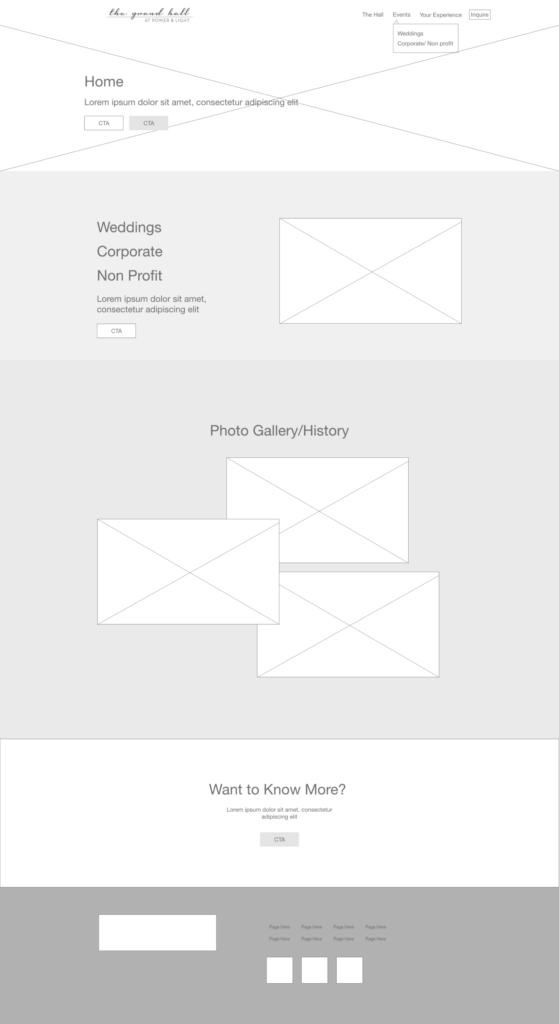
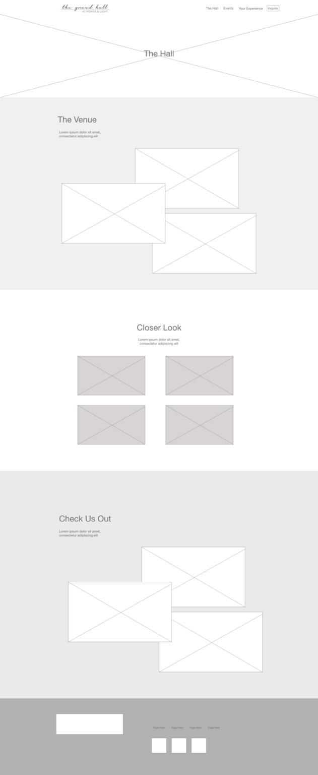
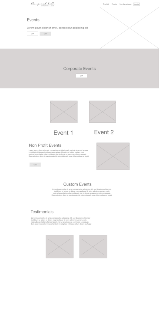
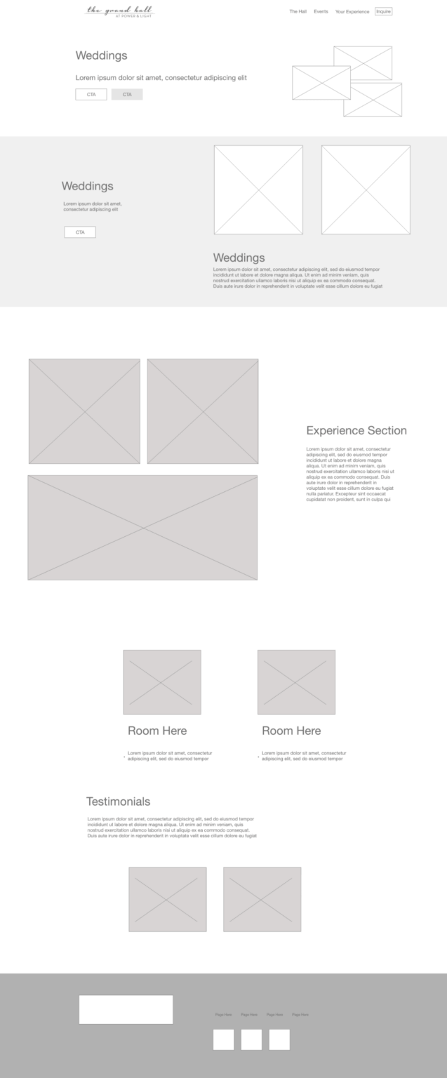
After some revisions, we were able to pass this along to the stakeholders and hear what their thoughts were. They were thrilled with the ease of navigating the flow, as well as the number of photos that we had planned to show off the venue. The goal of incorporating elements to catch the attention of visitors quickly was starting to take shape as well.
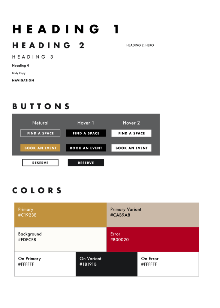
Our team was able to collaborate with our internal design team to come up with the brand guidelines and overall style of the site and corresponding print designs. The black, white, and gold colors selected were symbolic of the elegant nature of the venue. Strong borders on design elements were added to promote the strong lines of the building itself. A fun piece that we added was incorporating marble into the scheme as well. The architecture inside of the building is highlighted by marble pieces, so why not add them to the design elements as well?
Futura and Helvetica Neue were chosen as the web fonts for the website. They are both strong sans-serifs that scream sophistication. Adding spacing to the kerning, and uppercase to the headings were included to make the site stand out from the rest.
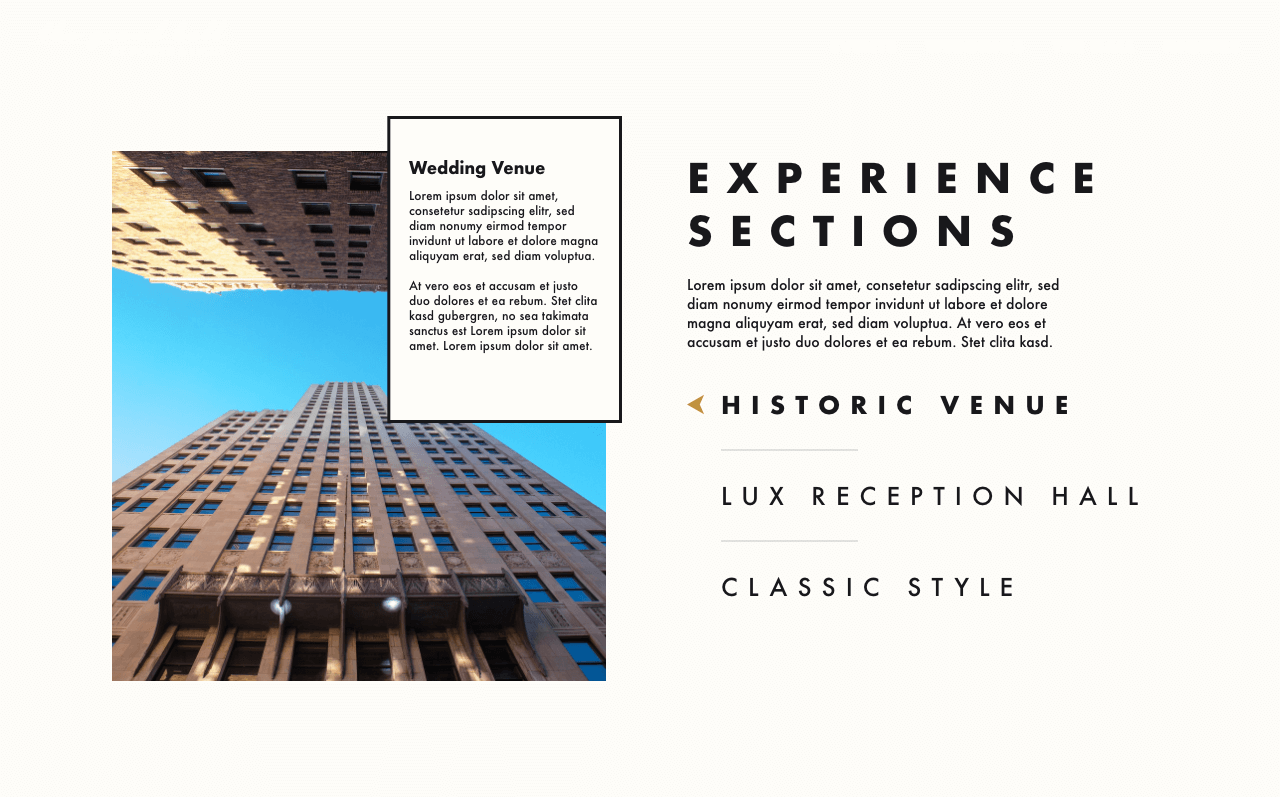
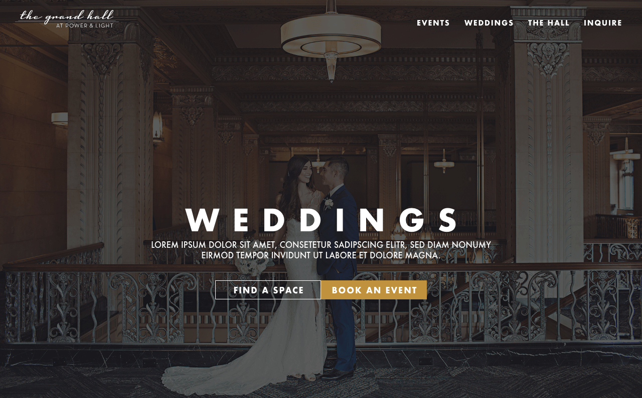
Once we had gotten approval on the wireframe and style guide it was time for us to put together some hi-fidelity artboards. Our goal was to create three or four options for the stakeholders to pick from. As mentioned before, we were going for an elegant look and feel mixed with elements to catch the eye in a matter of seconds. Below are the options that were presented to the stakeholders.
Once again, they were very pleased with how we had taken on the challenge to make the venue stand out. Adding a large number of photos of guests as well as the venue itself caught their praise. This phase allowed us to hone in on creative features, lock in fantastic photos, and use our previous phases to drive design decisions.
These are the iterations they did not choose. Though we did use them to guide us on the final iteration.
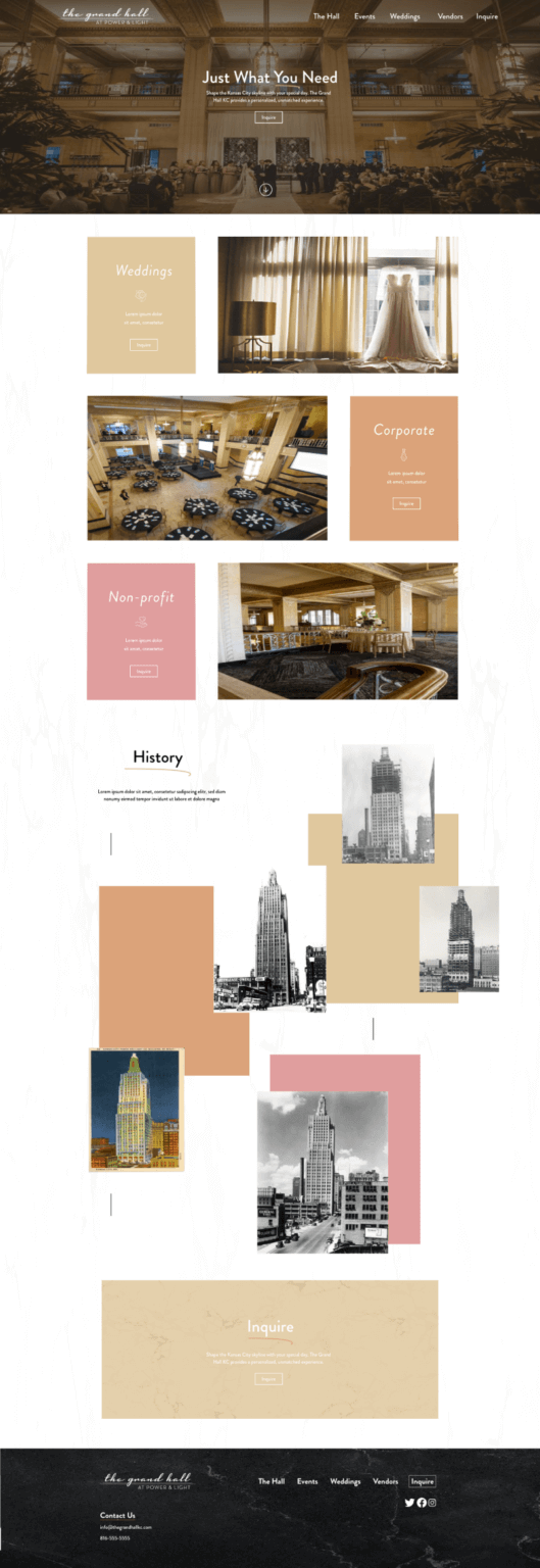
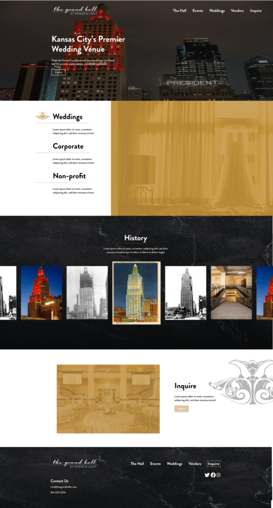
The finalized product is a website that represents what The Grand Hall is and shows off what a magnificent venue it is. The incorporation of ways to make our stakeholder's jobs easier (custom forms, integrated Calendly) alongside the interface and experience to catch the eye right on page load.
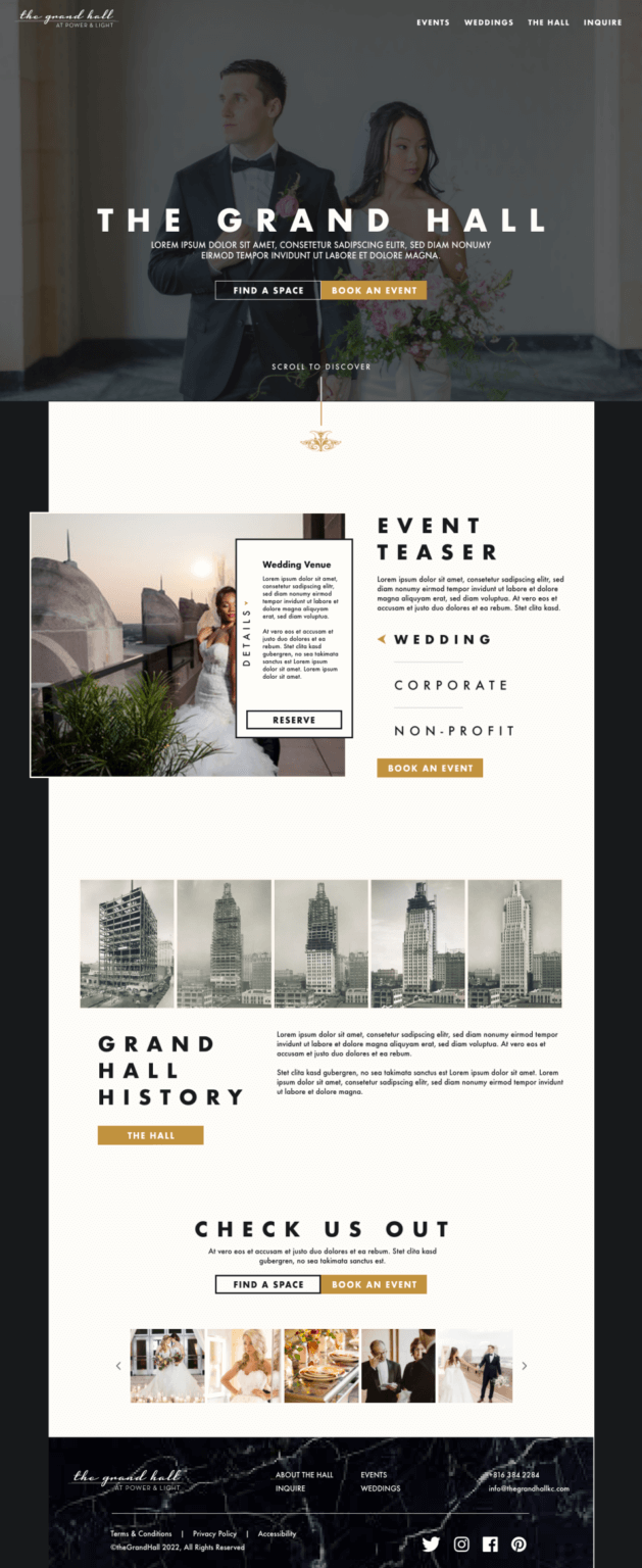


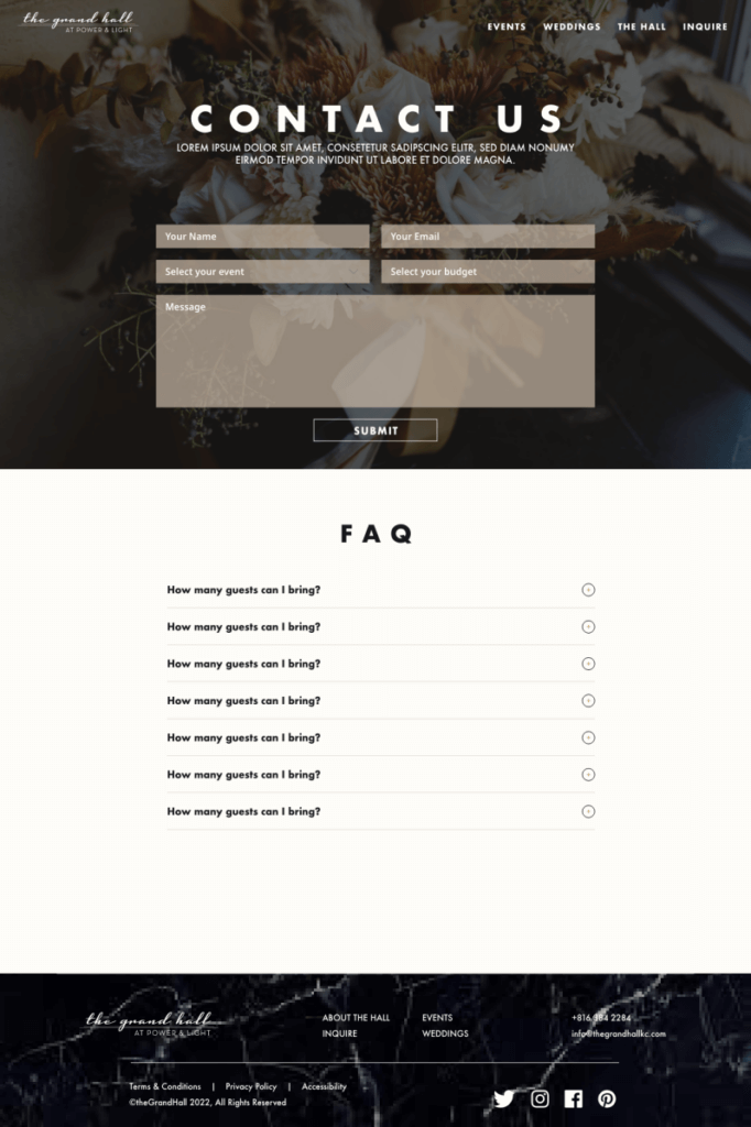
We then spent the next few weeks building out this site and getting it launched for people to enjoy. Making a website for a venue of this stature was a really rewarding experience. Creating a website that highlights beautiful architecture for one of the most iconic buildings in all of Kansas City gives a real, tangible feel of success.
The Grand Hall website was a fantastic undertaking for our team. It stretched us in new ways. The site gave a new perspective on a whole new industry that none of us had spent much time in. Each decision needs to be intentional when each inquiry could lead to many thousands of dollars in play with each potential visitor. Having the ability to shape the outcome of people's special day/ or large event in a positive way was very fulfilling.
