
At a Glance
Problem: Assisted onboarding couldn’t scale and slowed customer acquisition
Role: Senior UX Designer, end-to-end ownership
Scope: External web + mobile onboarding, backend constraints, operational workflows
Outcome: Reduced completion time, increased application volume, lower operational cost

Where The Process Broke Down
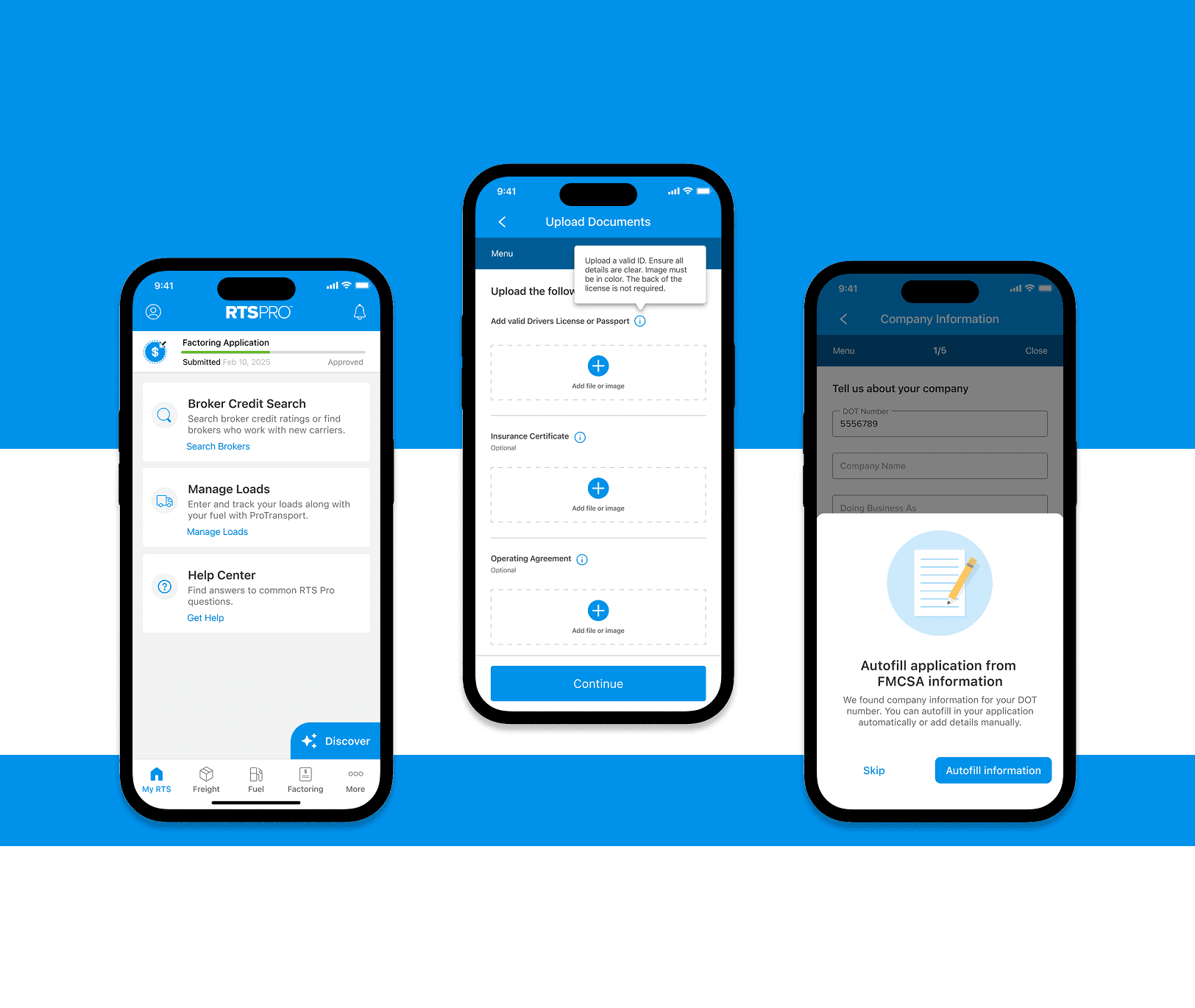
Customers couldn’t apply on their own. Every onboarding required a sales rep, which created drop-off and slowed everything down.
What Needed to Change
Users needed a direct path to start and complete an application. Sales should support the process, not control it.
Tradeoffs Made Early
About 20% of the application was removed or deferred. The focus stayed on what actually needed to be asked upfront.
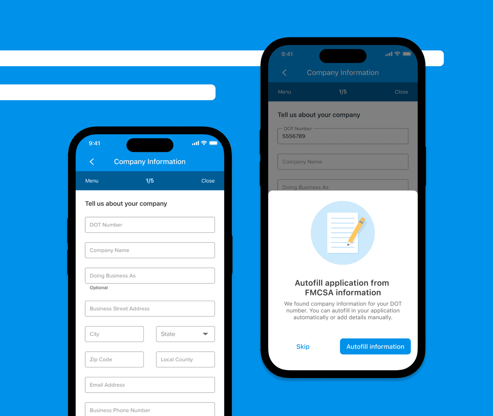
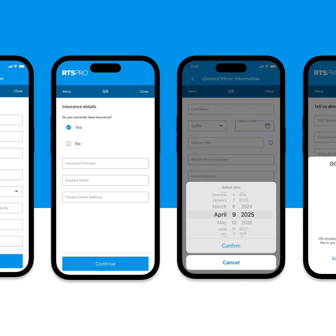
Establishing a Flexible Structure
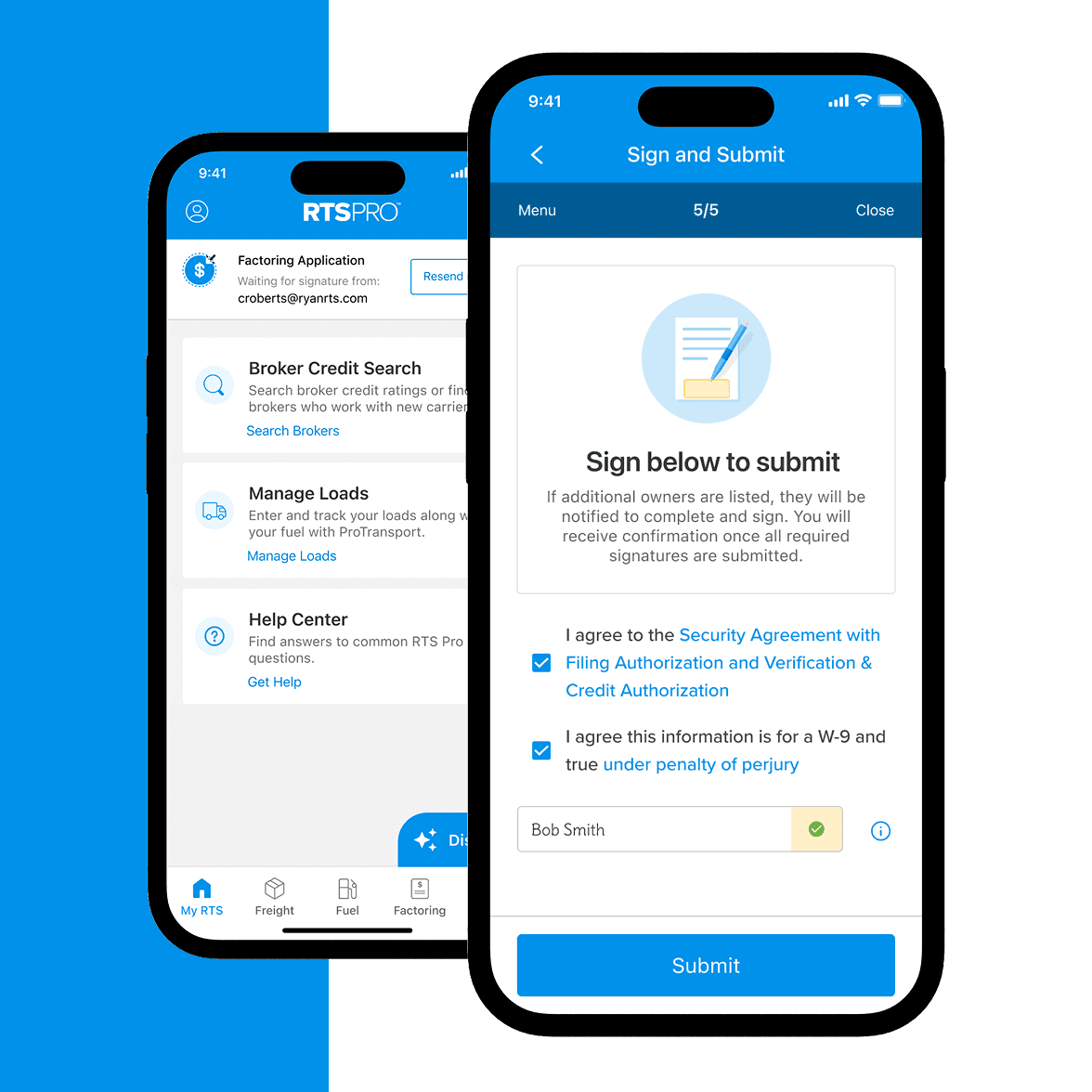
The flow was built to evolve. Five steps, clear progress, and the ability to leave and return at any point.
Making It Easier To Complete
Inputs were grouped and spaced to reduce friction. Progress indicators kept users oriented.
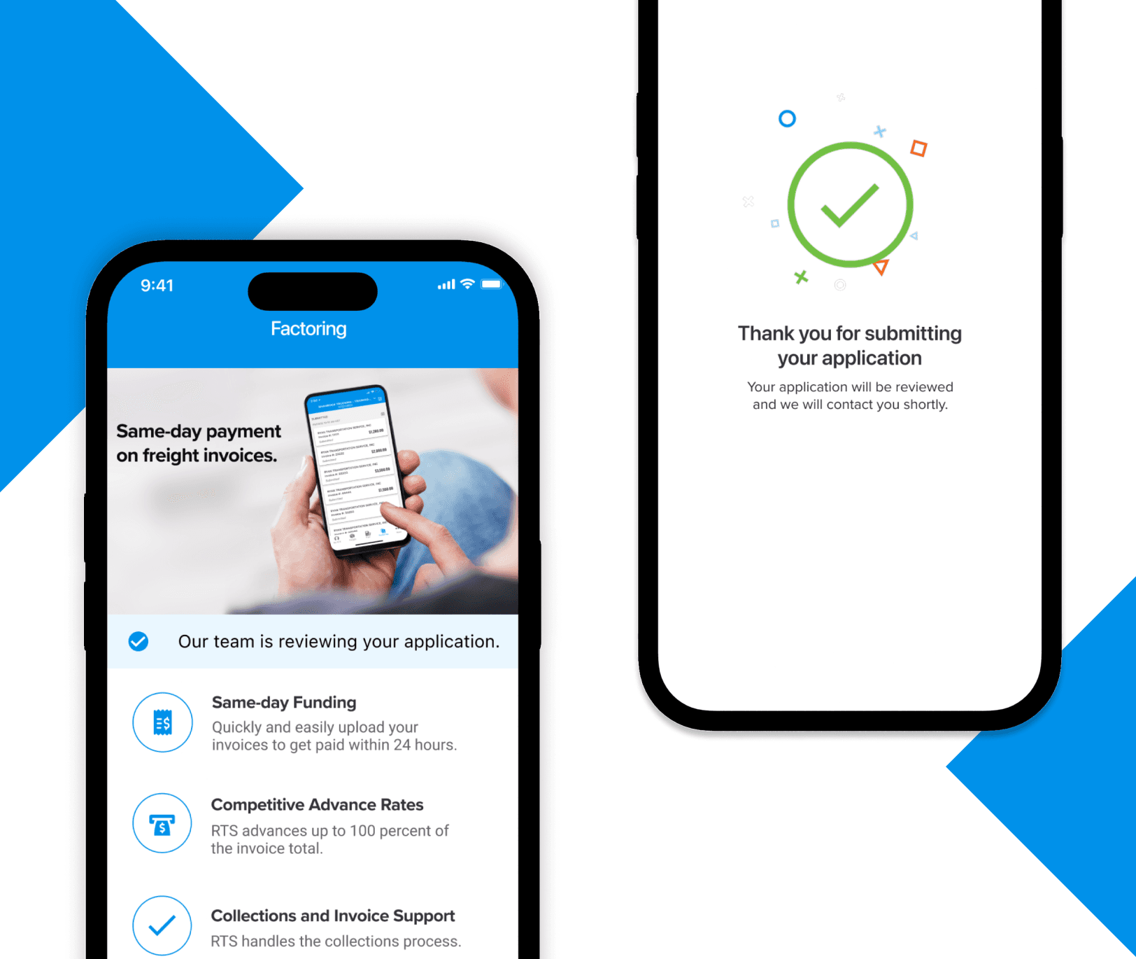
Once the experience was live, the impact showed up quickly and the results were immediate.
$60,000
$3M+
30
Minutes
98%
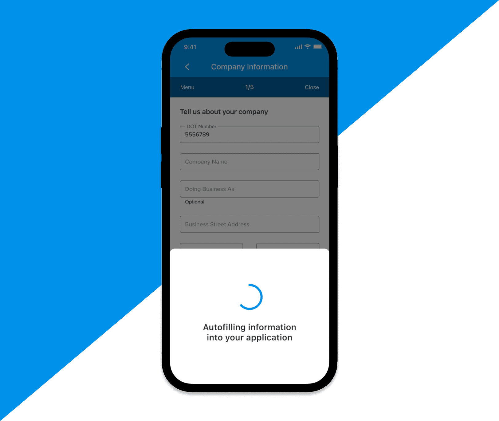
Where the Experience is Heading
Upcoming phases include a web-based version that allows sales reps to send custom application links, eliminating the need to download the app. Additional work includes pre-filled fields using public data and deeper integration into a new payout workflow.
This project positioned me to continue leading some of the most impactful initiatives across the company.

Reflections & Impact
Designing for Change, Not Finality
Balancing Business Pressure and User Trust